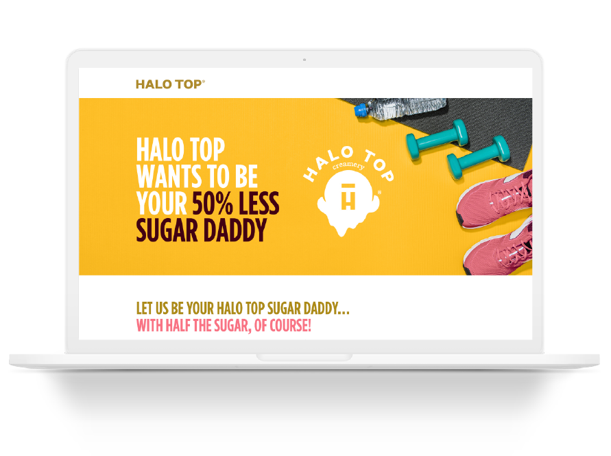
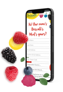
Does your brand prioritize the development of its promotional websites? 85% of Americans spend time online every single day, with an astounding 31% claiming they’re online “almost constantly,” according to a recent study from the Pew Research Center. As we spend more and more time on our smartphones and various other connected devices (think things like virtual reality, augmented reality, and even voice activation), you simply must invest in your brand’s online presence in order to be successful and stay competitive.
You can run the most exciting promotional campaign in the world (if your work with us, you probably will), but without an equally as exciting promotional website, it, unfortunately, won’t be worth a dime to your brand. Meet your consumers where they are for the best chance of engaging with them in a meaningful way and provide them with a beautiful and functional promotional website.
With an effective promotional website, your brand can:
- host all of your promotional campaign’s critical information
- accept sweepstakes entries
- collect user-generated content from a contest
- create your loyalty program’s digital home
- and much more
What is a Promotional Website?
Sometimes referred to as a “microsite, ” a promotional website may exist as a standalone website, as simple as a single page, or it can consist of multiple pages. Either way, a successful promotional website has one essential function; to host all the relative information your consumers need to know about that particular promotion.
While your promotional website development is only one part of your program, it is a crucial part nonetheless. When done correctly, a successful promotional website should be more than just an entry form, it should be an informative and engaging tool for your consumers to learn more and connect with your brand.

The best promotional websites bring engage consumers and bring them back again and again. The worst promotional websites include confusing forms that are too long to fill out, inconsistent creative, and fail general website best practices.
Support your brand’s promotional campaign, delight your target audience, and increase conversions all with our simple promotional website best practices.
Create a Truly Engaging Site for Your Promotional Campaigns
As marketers, we’re all probably familiar with the feeling of “shouting into the void.” All too often, we’ve created great content with amazing copy and compelling visuals and nobody sees it. Play a sad trombone sound now.
In order for your brand to develop the most effective site possible, you must of course do your research into your target audience. Avoid the pitfalls of shouting into the void and create a site custom-fit for your audience.
For example, Americans spend an average of 2 hours and 55 minutes on their smartphones every day, and 70% of all web traffic is conducted via mobile devices. But that doesn’t necessarily mean your target audience will find you with their phone (ours doesn’t! You’re probably reading this on a desktop computer right now!) Take a look at your web analytics for your website as it is now to understand a few critical factors about your audience to guide your promotional website development.
Factors to Consider When Developing Your Promotional Microsites:
- How your audience views your site- desktop or mobile?
- Where your website visitors come from- direct search, paid search, social media, etc.
- Which of your website pages attract the most visitors to get the most conversions? Why do you think these pages perform so well?
This isn’t an exhaustive list, but rather just something to get you started as you brainstorm your brand’s own promotional website development. Spend some time on your own and think about what matters most to your consumers and determine how to get that information onto the page.
The Components of Successful Promotional Website Development
While the process is quite similar to that of standard web development, your promotional campaign’s microsite will need a few unique items as well.
Here’s a brief list of all the essentials you should consider including in your promotional website:
- Hero section with promotion name and call to action (CTA)
- How to enter
- Entry form (if applicable)
- FAQ
- Prizes
- Official Rules
- Footer (privacy policy, terms of service, etc.).
Maintain Consistent Creative Throughout Your Promotional Microsite
In addition to engaging visuals, be sure to create consistent creative assets throughout your promotional website. After all, your promotional campaign should be an extension of your current brand, not a confusion of it. Don’t muddle things up and try to create new branding for your promotional campaign. If you feel like creating a logo to support your sweepstakes, contest, promotional game, or loyalty program, be sure it follows your current brand standards and will be easily recognizable.
Just like with your brand, your promotional microsite should feel cohesive. Each section should feel like it belongs with the rest. This will benefit you since your consumers will have a more seamless experience with your microsite. If you can, try to host your promotional website with the same URL as your current site.
An example of how this works in practice, we worked with Blue Bunny and their agency partners, to launch a multi-part campaign that featured three separate promotions: the Blue Bunny Summer of Funlightenment. Even though the Summer of Funlightenment had three separate promotions, each campaign was consistent in both messaging and creative, making learning all the ins and outs of each program easy and efficient for the user.
Bring a strong Emphasis to your CTA
As with most marketing campaigns, creating a strong emphasis on your call to action is even more important when executing a promotional campaign. In many cases, executing a promotional campaign includes a significant investment of not only money but time and effort as well. In fact, in our recent survey of over 500 marketing and brand professionals, we found that nearly a quarter of brands spend at least $10,000-$25,000 on promotional campaigns.
Get the most out of your brand’s investment and increase conversion rates with a strong and compelling call to action.
Since this is where you will direct your consumers to register and log in, enter your sweepstakes, upload a game piece code, submit their contest entry, etc. This button should be easily visible, contrasting from the background, and should be included in each section of your main page, OR should be a floating element that follows the user as they scroll. In other words, your CTA should be clear, accessible, and easy to complete.
In addition, make sure that the wording on your CTA is clear and concise. After taking all the right steps to get your target audience to your promotional website, don’t lose them at the last second. According to marketing research done by Optimizely, a five to seven-word call to action is most effective at converting leads, so try to keep yours around that length. The last thing your promotional campaign needs is a confusing call to action!
Finally, when crafting a compelling call to action for your campaign’s promotional website, be certain to include actionable language that states a clear benefit to your visitor. Phrases like “learn more,” “submit,” and “sign up,” for example, are not very interesting. While they do fall with five to seven words, these phrases don’t tell viewers why they should submit their info. Try to tell visitors what they will gain from entering your promotional campaign.
Some Compelling Call to Action Examples:
- Sign up now to win big
- Enter for free front-row tickets
- Share for your chance to win
Fabulous Forms
Another very important feature of your promotional website is your brand’s registration form. This is where many promotional microsites can see a high bounce rate if done incorrectly, so pay close attention.
Large, long forms can be daunting and can scare away visitors. With too many items to fill out, most visitors will simply abandon a long-form. Try to keep your form as short as possible, only include essential form fields for your users to fill out.

However, keep in mind that the shorter your form, the more people who will fill it out. If your brand hopes to generate as many leads as possible, a short and sweet form should do the trick. With this strategy, you may find that your brand is collecting plenty of unqualified leads. Almost as frustrating as not having enough leads is having too many poor leads.
In this case, having a slightly longer form may actually benefit your brand. As a barrier to entry, longer forms discourage “sweepers” or bots from simply filling out any and every form they find online. They help ensure only dedicated, qualified leads are participating in your campaigns and taking space in your CRMs.
Looking for the best of both worlds? You can design your registration form to only show a few form fields at a time, so consumers don’t see a big wall of questions and get overwhelmed. Remember to carry your engaging visuals through to this page too.
In addition, there are many entry mechanics you can use to make your entry form exciting, enticing, and easy for your consumers. Whether entry is with unique codes, geofence locations, scanning with visual recognition technology, or more, customized digital solutions can make your promotion’s entry as seamless as possible. Be sure to consider a partner, like MRi, who can handle them all.
Engaging Visuals Within your Promotional Websites
A promotional website should be fun and engaging for your audience. That’s what promotions are all about after all. When creating your campaign’s promotional microsite, do not leave the campaign creative as an afterthought.
Of course, video is the king of content, so incorporate it as often as possible. Most web visitors spend enough time on an average site to view anywhere from 3-5 images. You’ll want to ensure that the imagery your audience sees front and center is the most interesting that you have.
For example, if your grand prize is an exciting brand new car, put that car front and center on your website. In addition, since promotional websites are oftentimes standalone web pages, go a little outside of your comfort zone to make a truly fun and unique experience for your fans. Add some moving parts, exciting colors, and much more to get your users’ attention.
Your Campaign’s Thank You Page
Once users complete your desired action, be sure to include a thank you page on your promotional website. This is an important, but easily forgotten element for your promotional microsite, and websites in general.
Without a thank you page, consumers may doubt whether or not their entry was submitted. Leaving them confused and frustrated, they may try to resubmit (multiple times, even) or abandon your brand altogether. This can leave your users with a bad impression of your promotion and by extension your brand.
A thank you page should appear after users submit the form on your website. This page can also be a great way to educate users on information such as when they will be notified whether or not they won, how you will inform them, when the promotion ends, if they can enter again, etc..
Your promotional website’s thank you page doesn’t have to focus solely on your active campaign, either. Instead, use this as an opportunity to direct your website visitors to other valuable content. As this may be some viewers’ first impression of your brand, this is a great time to share important information and messaging with them.
Security
Above all else, security is the most important aspect of your promotional microsite. When executed correctly, your website visitors won’t even realize it. Beyond just the standard security needs of a regular site, your promotional website’s security must be in order. According to the National Telecommunications and Information Administration, concerns about online privacy and security are only going. For example, In 2019, 73 percent of Internet-using households in 2019 had significant concerns about online privacy and security
Since you will be collecting data from your website visitors, it is essential that their information is protected and secure. Any information, and we mean any at all, should be disclosed in your privacy policy on your site. You should also list why you’re collecting that data, and how it will be used.
In addition to protecting your visitor’s personal info, you will want to make sure your brand is protected as well with official rules. Creating your campaign’s official rules is a critical step to ensuring the validity of your promotion, preventing cheating and fraud, and informing participants. For more expertise on developing your promotional campaign’s official rules, check out our full guide here.
Official rules provide users with all the necessary information for your program while also protecting both the user and brand. The right promotional company will be able to ensure a legal promotion with the utmost security in place.
Conclusion
Promotional websites are so much more than just a registration page and rules! Done correctly, a promotional microsite can be a tool for boosting program awareness, entries, and ROI. With the best practices listed above, your promotional website should be a great foundation for the success of all your promotions.
If you’re looking for more insights on promotional marketing, sweepstakes, contests, loyalty, and more, check out our case stories and some of the successful promotional sites we’ve created for our clients. Developing a custom-built promotional website is only a small portion of our digital promotion services at MRi, but an important part of our overall promotional marketing strategy. After years of helping brands create exciting and purposeful promotions, using our own IDEA plan, we know the difference a great promotional website makes. Contact us today to start a conversation!


